|
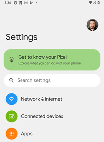
In Google's brand-new Developer Preview 3 release of Android 12, the Settings menu looks a little different. Compared to both Android 11 and A12 DP2, the updated version is prettier and less dense, but does away with the subheadings to make it a little less clear where various options are. It also gets some new "bouncy" animations when scrolling. It's the new look for the Settings menu, previously hidden behind an ADB command and labelled "silky home."
Comments
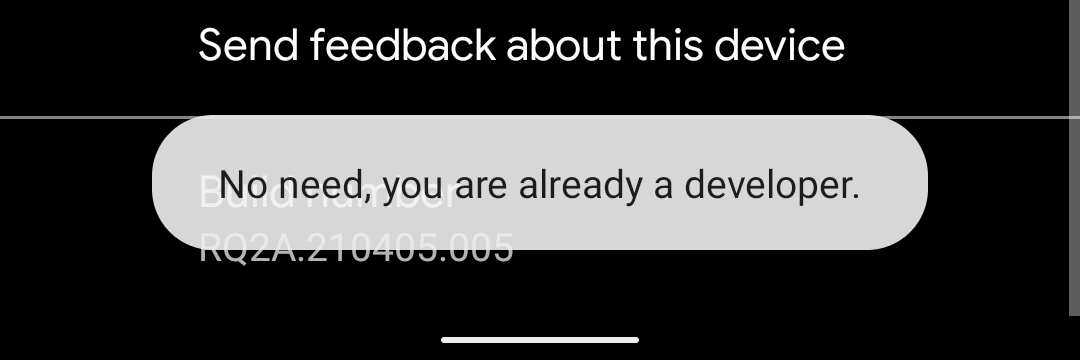
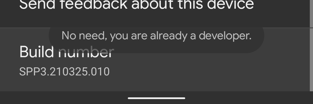
Dark mode was fully integrated into Android almost three years ago at this point, but some parts of the system have slipped through. In Android 12, Google is finally bringing a dark theme to toast messages. Toast messages, for those not versed with the admittedly somewhat obscure term, are those little pop-ups that appear at the bottom of the screen with messages. One of the easiest ways to see a toast message is to dive into the “About Phone” section and tap on the “Build Number.” You’ll then see a toast message about unlocking developer settings. With that out of the way, this commonly-used part of Android has been around for years and remained mostly the same. In Android 12, it gets a slight design tweak that puts it a little higher up on the screen, at least on Pixels, and a tweaked font, too. More noticeably, the message now matches your system theme, meaning Android toast messages now support a dark theme. It’s a minor tweak, of course, but it’s one that really helps with overall consistency. Notably, though, it only applies if the app generating the toast message supports dark theme. Android 11 (left) vs Android 12 DP3 (right) |
Archives
July 2024
Categories
All
|


 RSS Feed