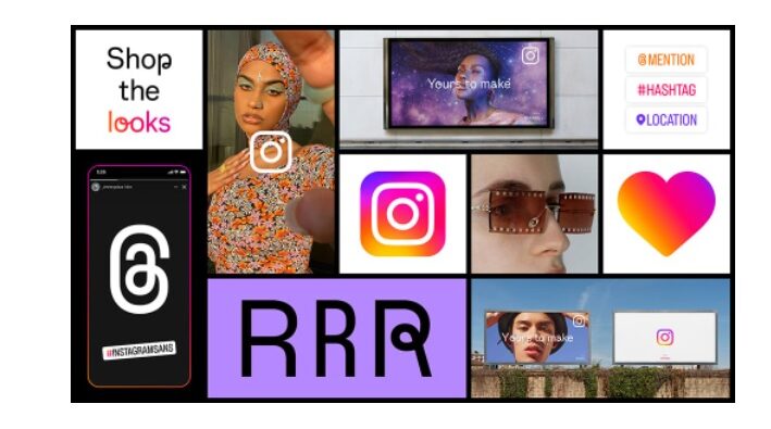
Instagram Sans is inspired by the design elements that characterize the platform, reflecting the company's commitment to simplicity and craftsmanship.
Instagram aims to highlight a distinct identity with a character inspired largely by the combination of squares and rims (squircles) and in some places it is possible to recognize the evolution of the Italics logo that Instagram has used for years. Among the new characters is Instagram Sans Regular, Bold, Light, Medium, Condensed and Condensed Bold.
Most of the Sans Instagram characteristics are quite simple Sans-Serif. Social said that he had collaborated with expert linguists to make sure that the typographic character works in as many languages as possible, including languages such as Thai and Japanese.
The gradient has also been reinvented with bright colors and a more alive appearance to inspire moments of discovery. Instagram notes that the gradient has been reinvented using a 3D modeling process.
In terms of new entire screen marketing layout, Instagram says it is designed to celebrate simplicity. The layout affects the way the photos and posts are displayed in the feed, however it is possible to use the navigation bar at the bottom to access the Discovery, Reels, Shopping and page card. Even the icons to change accounts, create a post, check the notifications and browse the messages are still on the top bar.
Everything has the purpose of creating a more distinct identity, especially by the competitor TikTok, however we will have to see how users will react about the new Instagram look.
Written by Matteo with love from Italy

 RSS Feed