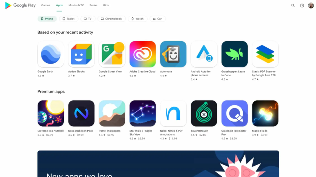
In particular, the web version of the Google Play Store has been modified, which is approaching from the graphic point of view to other services of the Mountain View giant and this occurs after many years of use of the same interface.
The new UI starts up with the Google Play logo and the cards dedicated to games, applications, films and TVs, books and children while on the right side, next to the user's image, there is the icon with the lens of enlargement to start the search for the desired contents.
In the viewing of the applications there are the filters for device (smartphone, tablet, TV, chromebook, clock and cars) and followed by the classic carousels with the recommended apps. The games section is similar, even if the filters for clock and cars are not shown and there are much larger applications previews.
When you look at the page dedicated to an application, a large upper section is shown that highlights the key details (such as evaluation and reviews, the download number and the type of user to which it is intended) on a background blurry.
Next to the description of the app, a sidebar is shown on the right to recommend many other content to download while there is a section dedicated to data security.
Unfortunately, the dark theme is not supported (at least not for the moment).
According to what is learned, at present this new web version of the Google Play Store is available for a good part of users but has not yet reached everyone. Those who do not view it probably have to still have patience only for a short time.

 RSS Feed